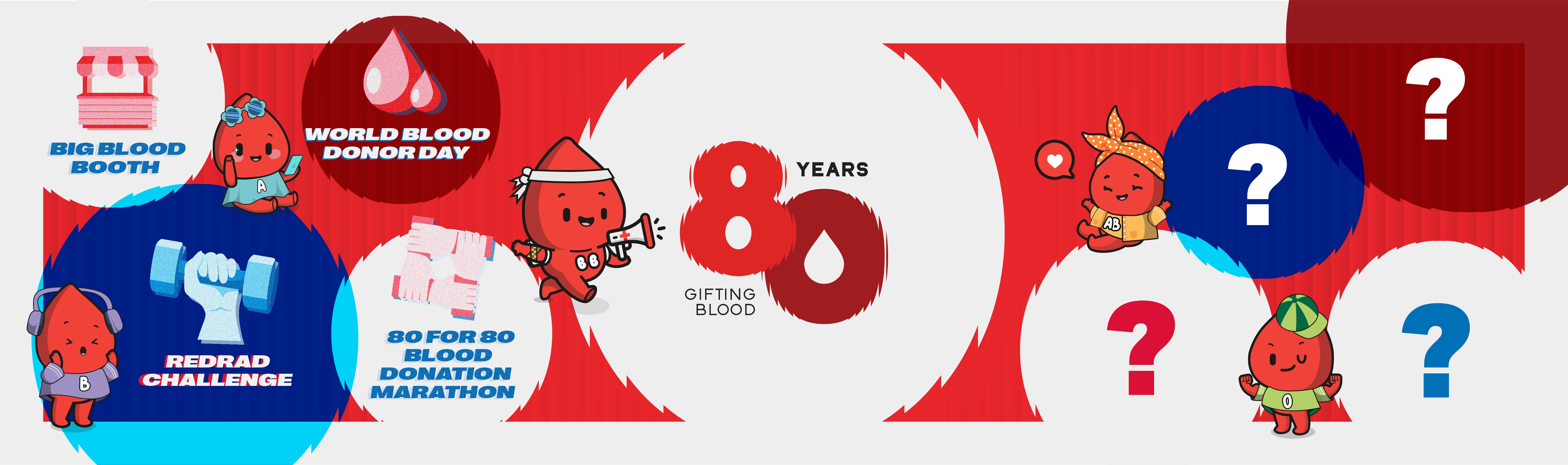
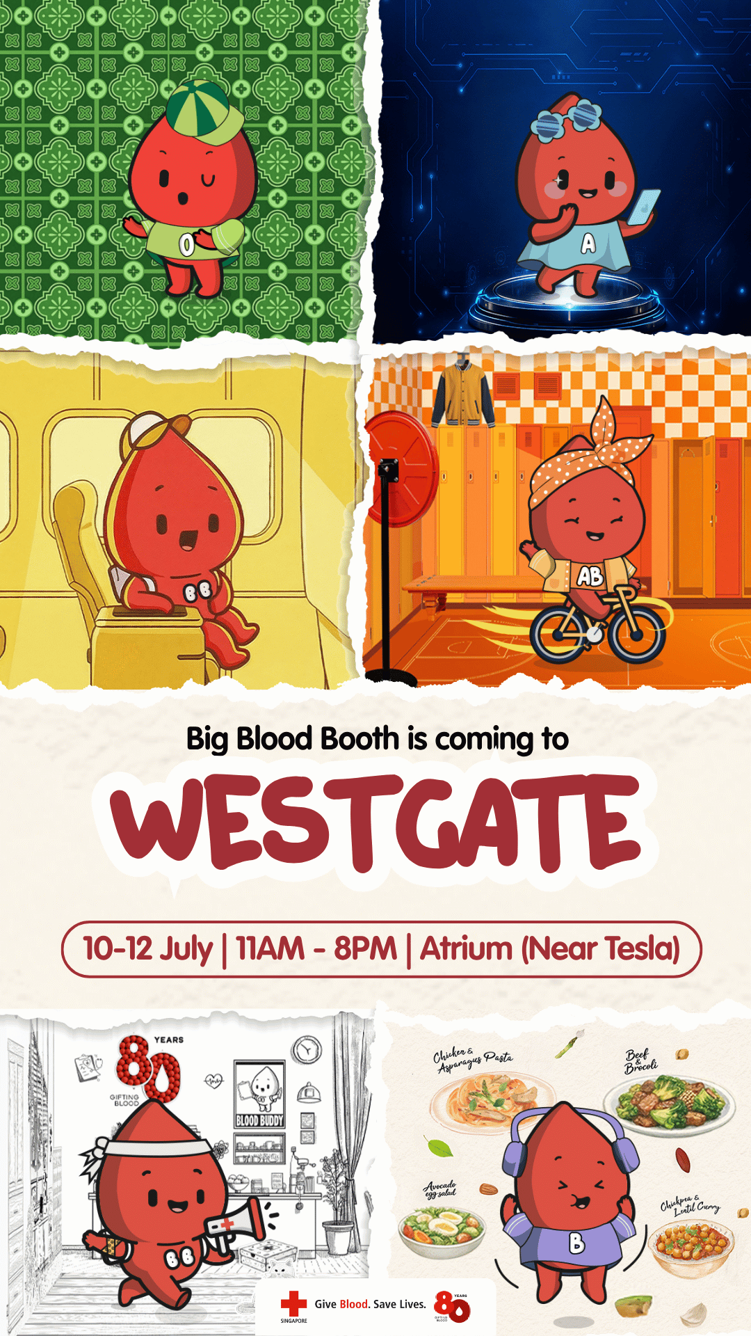
This anniversary mark is not designed as a badge of age, but as a symbol of impact. At its heart, the logo fuses two forms into one continuous idea: the number 80 and a drop of blood. What appears simple at first glance reveals a deeper intent – a visual expression of how one act of giving multiplies across lives, time, and generations.
The circular forms of the “8” are deliberately expansive and imperfect, suggesting motion rather than stasis. They echo ripples on water – a quiet but powerful metaphor for the expanding effect of each blood donation. One donor. One moment. Yet the effect travels outward, touching families, communities, and futures the donor may never see. The negative space in the “0”, rendered as a blood drop, completes the system: impact made visible.
This is not a logo about quantity donated or years passed. It is about continuity, capturing how each contribution feeds into a larger, living cycle of care. The visual overlap between the numerals reinforces this idea – no single act stands alone because each one strengthens the next. The design literally visualises the tagline, "Some gifts are made to keep going" by showing that the individual droplet of one action builds, piece by piece into the enduring legacy of 80 years.
The restrained palette of deep, rich reds and bold geometry conveys calm in crisis, steadfast commitment, and unwavering in purpose, reflecting the spirit of giving that beats at the heart of Singapore Red Cross. There is no ornamentation, because the message does not need embellishment. The power lies in the act itself - an act we are honoring this year through 8 key milestone events designed to celebrate our eight decades of service.
After 80 years, the story is clear. When one person gives, many lives move forward. As we prepare to reveal these upcoming activities, we invite you to stay tuned and watch as the ripple continues.
Join now and be the first to know when our details drop!
Follow us for first dibs and more updates on upcoming events and giveaways!

